
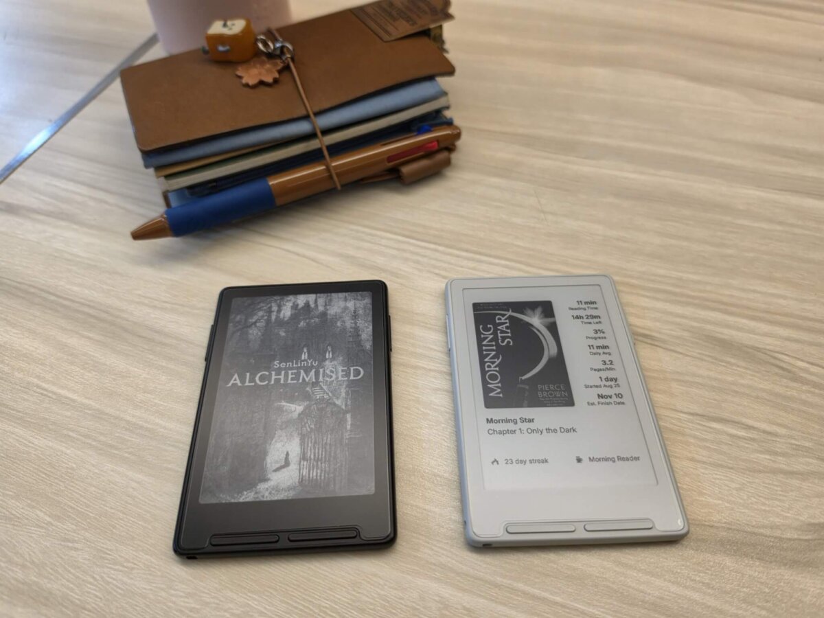
Choosing a new e-reader usually comes down to screen size, battery life, or front-light quality. But when it comes to the Xteink X3, the most surprising decision you’ll have to make is simple: Black or White?
Both versions pack the same specs into a ultra-compact, pocket-friendly footprint. Yet, depending on which colorway you slip into your bag, the daily reading experience feels surprisingly distinct.
If you’re stuck choosing between the two, here is how they stack up side-by-side:
| Feature / Aspect | Black Xteink X3 | White Xteink X3 |
|---|---|---|
| Visual Contrast | Winner. Black frame makes the page look whiter and text pop sharper. | Blends with the E-Ink background; softer overall contrast. |
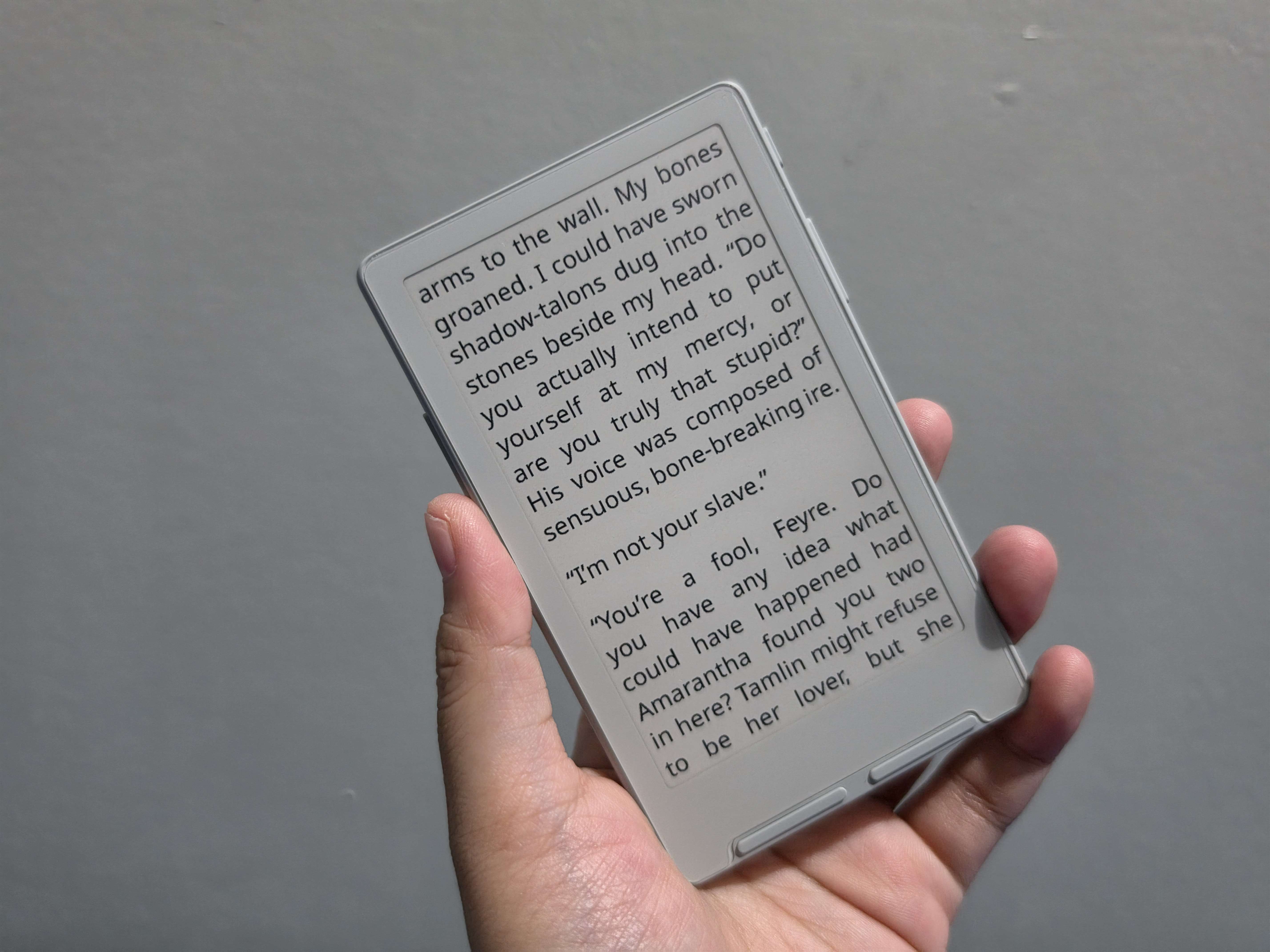
| Screen Illusion | Framed view centers eye focus strictly on the text. | Winner. Bezels merge with the screen, making the display look larger. |
| Direct Sunlight Performance | Holds up cleanly outdoors; zero bezel reflection. | Bezel reflects ambient light; prone to UV/sunlight text fading issues reported by users. |
| Dark Mode Experience | Seamless. Dark background blends into the bezels cleanly. | High-contrast border around dark background can feel jarring to the eyes. |
| Maintenance & Wear | Hides dust, oils, and button grime easily. | Front buttons and white finish show dirt, oils, and discoloration quickly. |
| In-Hand Feel & Aesthetics | Metallic, solid, and visually compact. | Smooth, glass-like finish with a slightly larger visual footprint. |
Why the Black X3 Steals the Spotlight
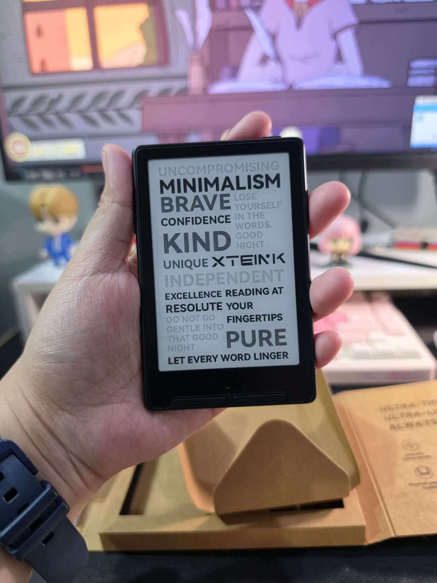
While both colors have their charm, the Black X3 takes the crown for everyday usability:
- Sharper Text & Better Focus: The dark border tricking your eyes isn’t a myth. The dark frame tricks your eyes into seeing a whiter background and crisper text. Plus, it grounds your vision right where it belongs: on the words.
- Made for Outdoors & Dark Mode: If you love reading in bright sunlight, the black bezel absorbs glare instead of reflecting it. It also avoids the sunlight-fading behavior that occasionally pops up on the white model. Night owls will love it too—flipping to Dark Mode creates a seamless, dark-slate look with zero awkward bezel contrast.
- Low Maintenance: Let’s be honest about pocket devices—they get tossed into bags and handled constantly. The black finish hides button grime, finger oils, and daily wear effortlessly. If you like using a magnetic ring to snap your X3 onto the back of a dark phone, it blends right in.
When to Go With White
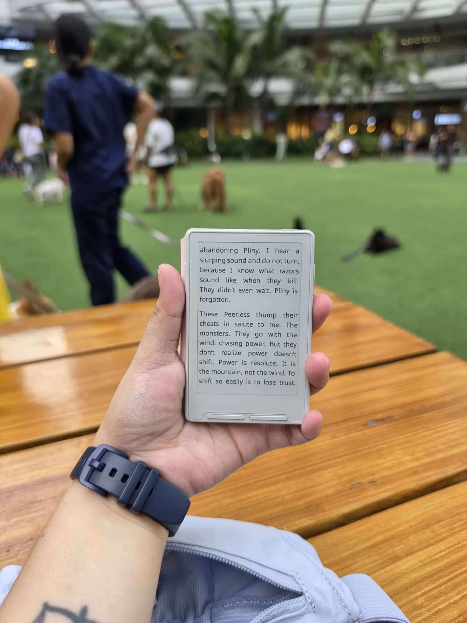
The White X3 has one massive selling point: the seamless “bigger page” illusion. Because the off-white bezels match the native E-Ink display color, the borders visually melt away. If you want your tiny portable reader to feel like a continuous, borderless sheet of paper—and you don’t mind wiping down the buttons occasionally—the white model delivers a gorgeous, airy aesthetic.
The Verdict
- Go with Black if you want maximum contrast, outdoor legibility, low-maintenance durability, and a sleek, compact profile.
- Go with White if you prioritize a borderless, expansive screen illusion and love that light, minimalist aesthetic.
Which colorway are you leaning toward for your daily reading setup?
Leave Your Comments